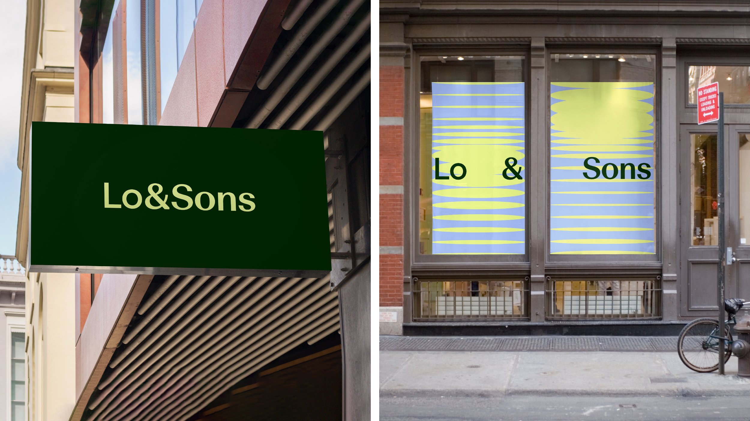
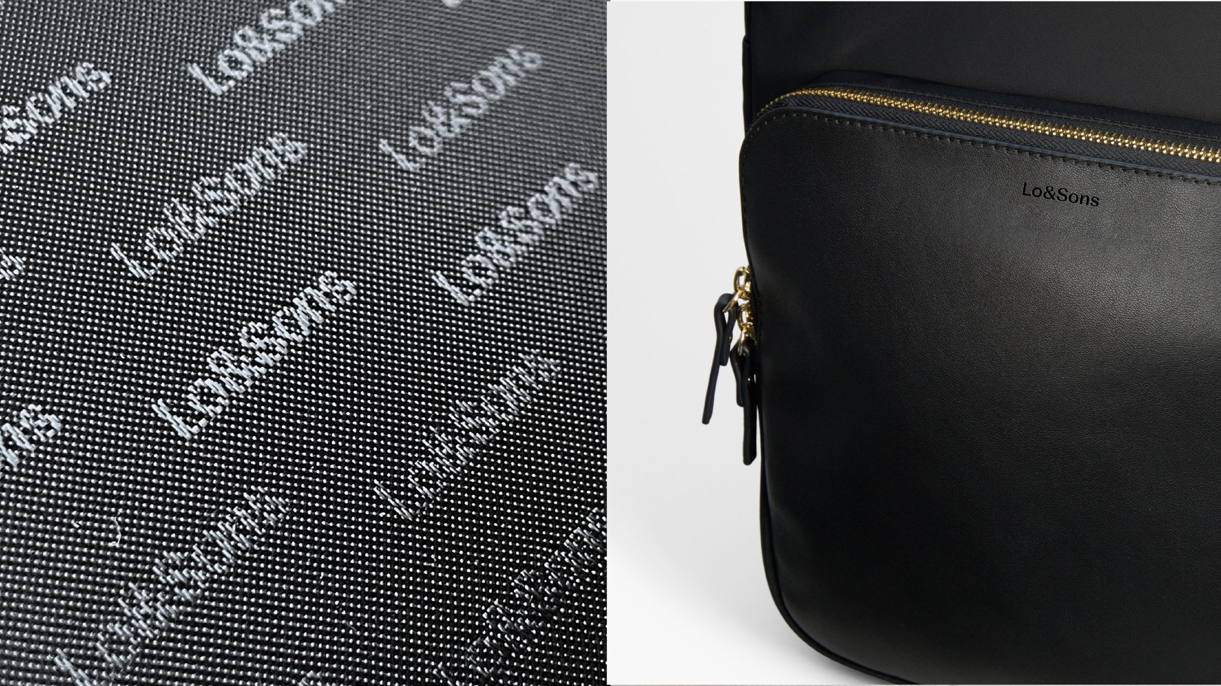
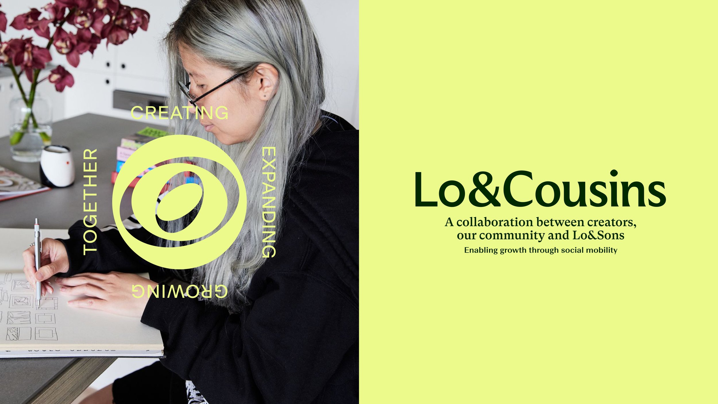
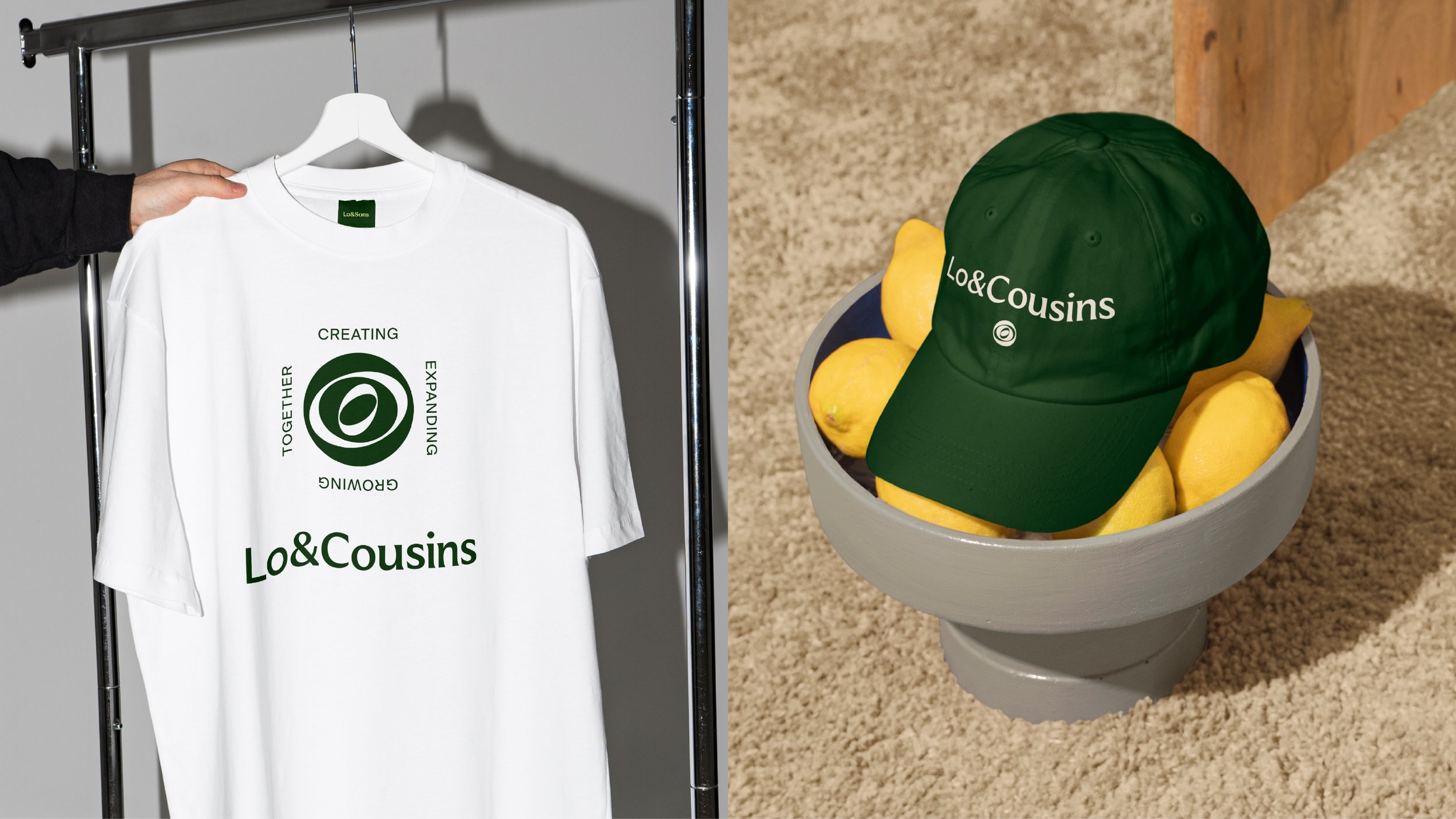
Lo & Sons Rebrand
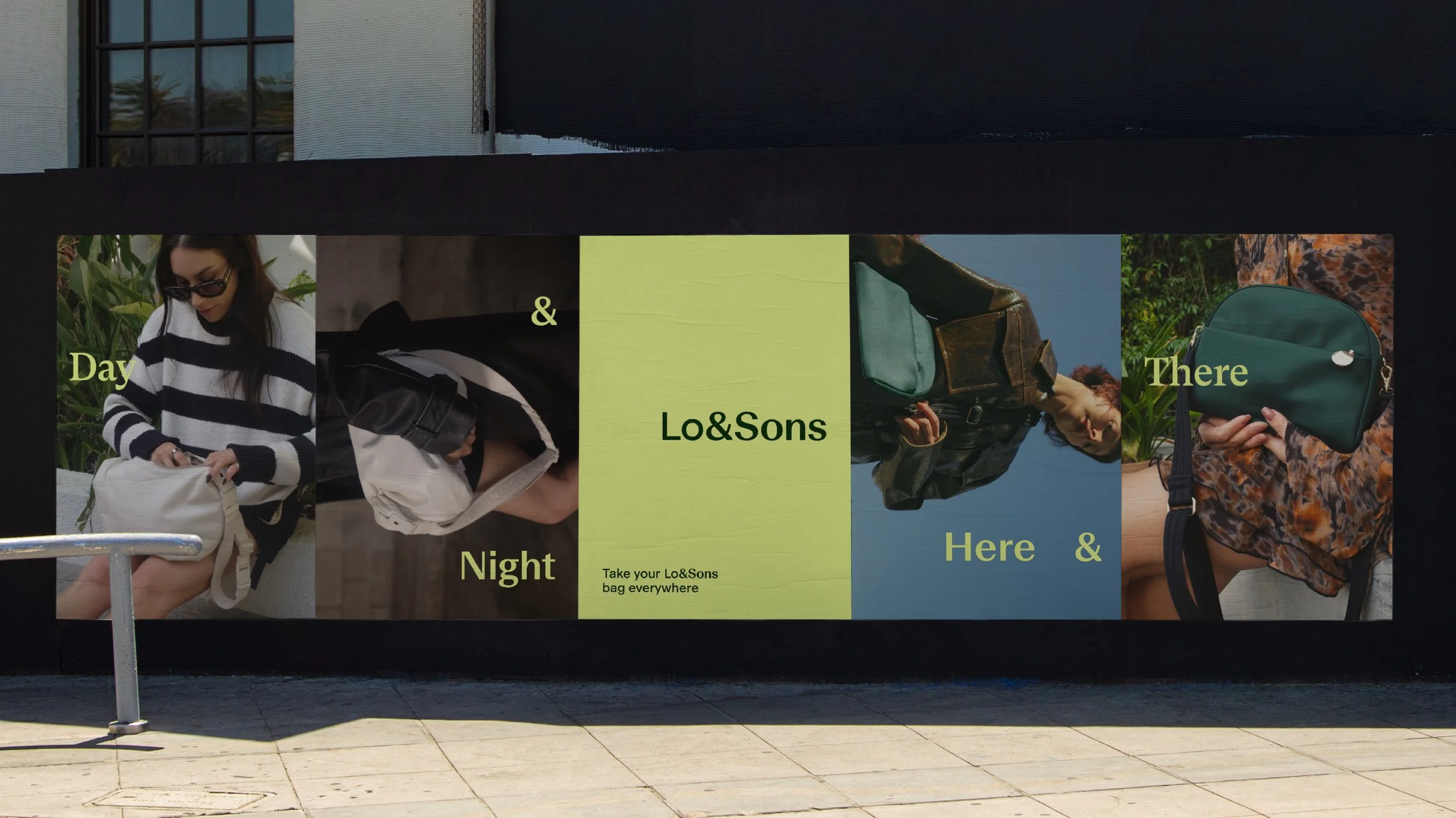
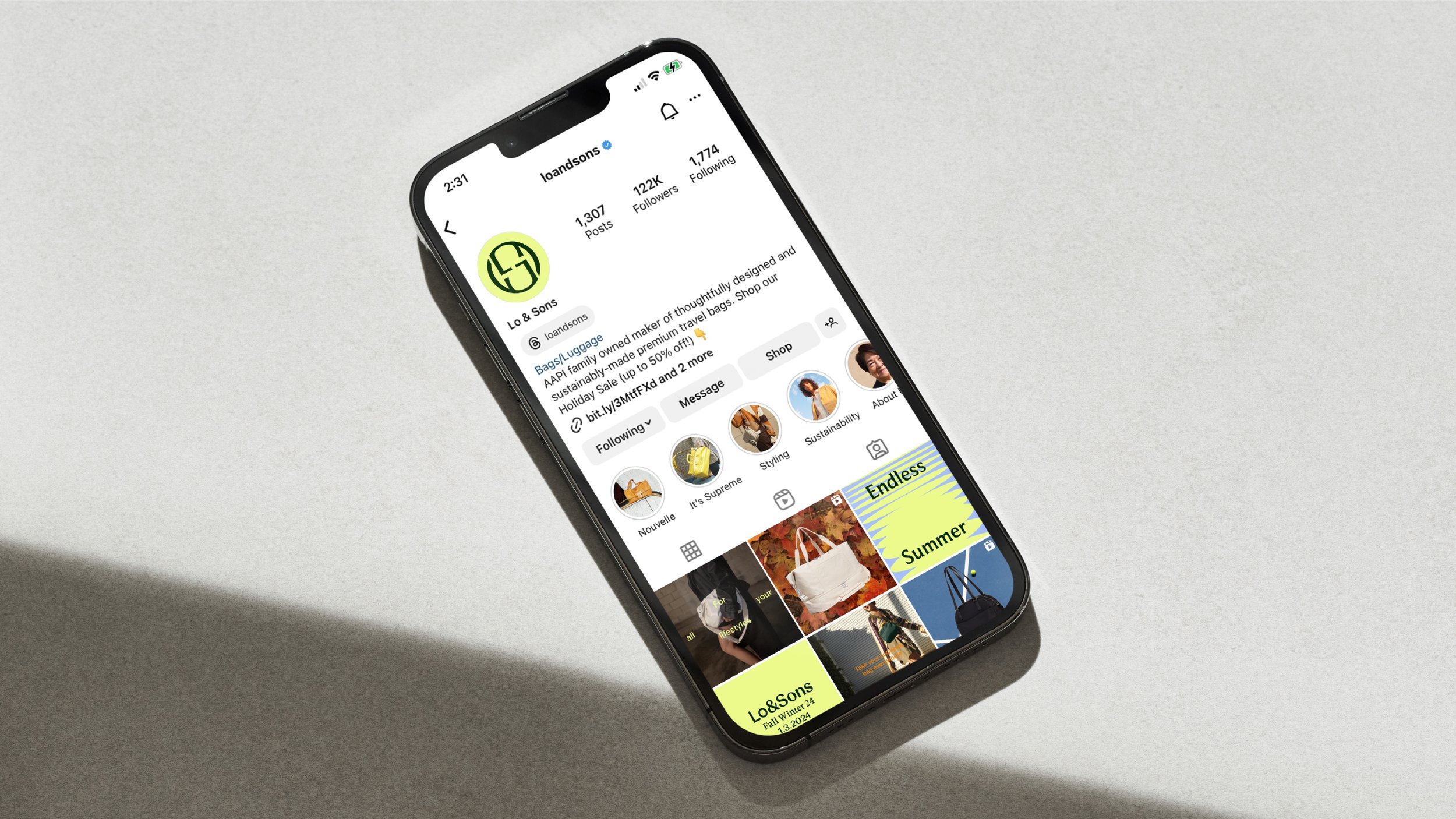
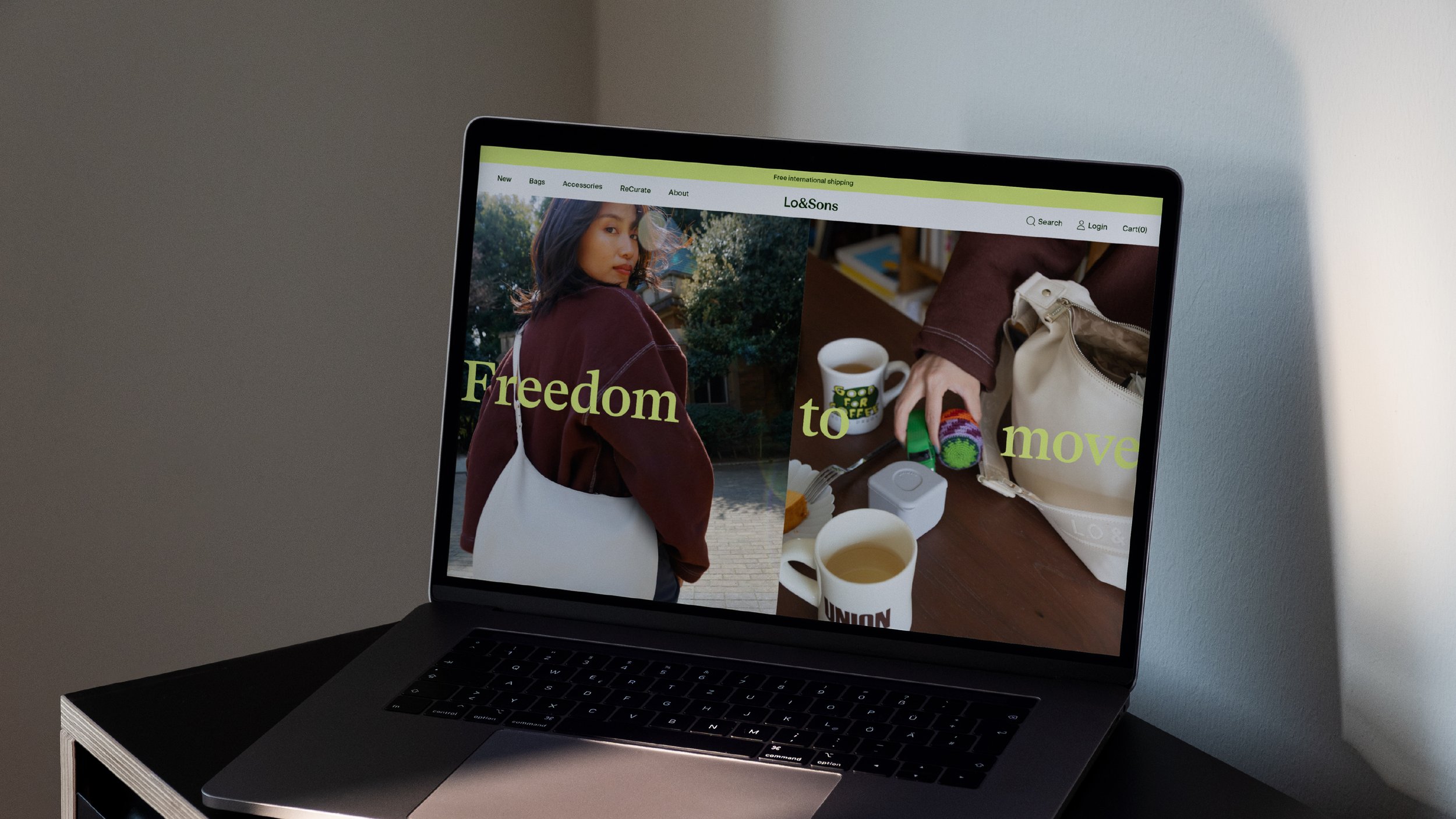
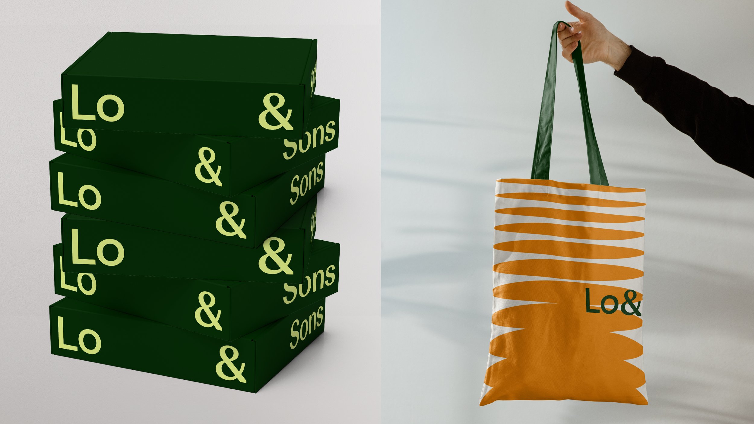
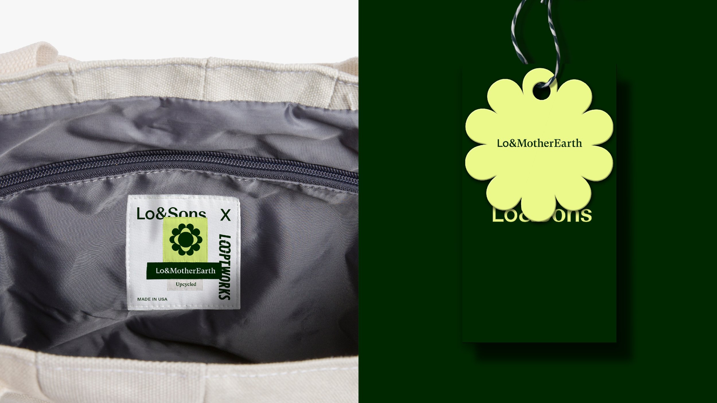
After repositioning Lo & Sons from being a travel brand to being a brand for everyday mobility across multiple lifestyles, we created the brand to bring this positioning to life. We utilized a collection of typefaces to represent the collision of seemingly different elements finding harmony and balance when used together. A shift in typeface represented a different initiative while the 'Lo' typeface (representing the family) was the unifying element across the marks. The type and the primary graphic both communicate the rhythm and flow of each person across their different proficiencies—from dad to DJ to CEO to whatever. The colours bring the energy of movement to the system as imagery captures these people as they flow through the different parts of their lives.